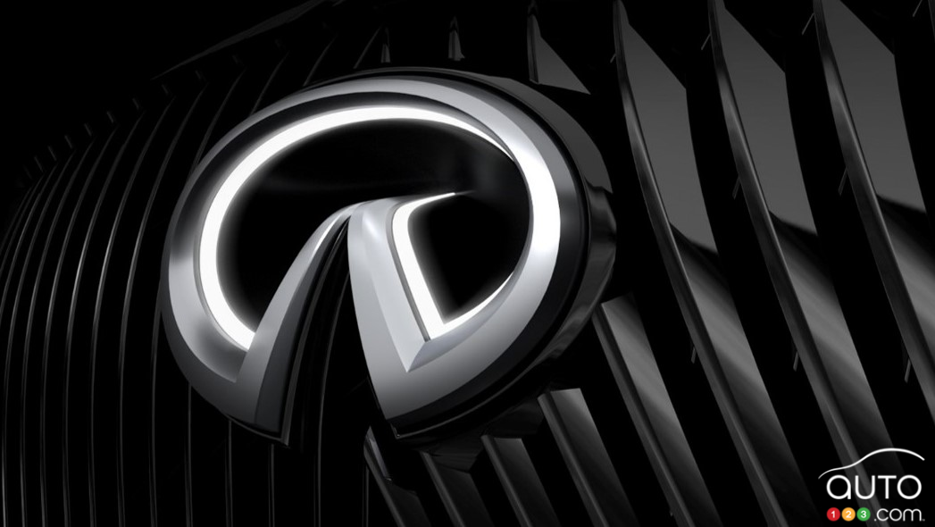
Infiniti Redesigns its Logo
 Infiniti Redesigns its Logo
• Infiniti presents a redesigned 3D logo and other changes to its brand image.
It's not uncommon for a manufacturer to change its logo, modernize it, if only via a mild tweak. This is done for all sorts of reasons. Sometimes, it's simply to make it evolve. On other occasions, it's to rejuvenate the brand's image, to give it a boost.
Such is the case with Infiniti, which has been stagnating for several years. The 34-year-old company has just introduced a third new interpretation of its original logo. A reminder that the company’s name – and its brand image overall – is designed to evoke a road that is infinite, that stretches all the way to the horizon.
Infiniti say the new logo’s design more explicitly emphasizes the infinite road and the horizon line. Whereas earlier versions of the logo ended in a sharp point in its middle, the new variant brings together two flat lines that extend into the background, like a road heading towards infinity. It is completed by a new spacing of the brand's letters that accentuates the horizon line.
Read more